
The same painting, printed at three different scales on three different substrates, tells three different stories.
From Twelve Inches to Seventy-Four Minutes
A vinyl jacket gives a designer roughly 929 square centimetres of front face. A CD jewel case front gives around 100. That ten-to-one ratio is not a cosmetic difference — it is a different object. When a Nordic metal label licensed a recording across both formats in the early 1990s, the art department faced a genuine translation problem, and the solutions are readable in the physical artefacts if you look carefully.
The most common approach was a straight crop: take the vinyl master artwork, identify the compositionally strongest quadrant, and cut to 120 × 120 mm. For paintings built around a centred figure — a common convention in the scene — this worked tolerably. Where it failed was in panoramic compositions, the kind of wide, horizontally staged landscapes that appeared frequently on black and death metal sleeves throughout the period. Crop a wide painting to a square and you lose either the left third or the right third; whichever you lose is usually where the artist placed the compositional tension. The vinyl owner and the CD buyer are, in a strict sense, looking at different pictures.
Spine text compounds this. A twelve-inch spine has enough real estate for band name, album title, catalogue number, and label logo in legible type. A standard jewel case spine — approximately 5.5 mm for a full-length — forces a choice: stack everything vertically in reduced type, or drop the catalogue number. Labels made different calls. Some collapsed the catalogue number into the rear tray card; others dropped the label logo to a small device. Reading the spines of corresponding vinyl and CD pressings of the same release is a clean way to see what each label treated as non-negotiable.
Format geometry
Colour reproduction diverges for mechanical reasons. Vinyl jacket printing in the Nordic market was typically handled by offset lithography on uncoated or lightly coated board; CD tray cards and booklets used a coated stock that accepted ink differently, with higher gloss and increased apparent saturation. The same four-colour separation printed on both substrates will read differently — what sits as a muted, earthy tone on uncoated board becomes more vivid on the coated CD equivalent. This was not always corrected between formats; a label working on tight margins sent the same file to both printers and accepted the results.
The CD booklet, though, introduced something the jacket never had: space. A sixteen-page booklet inside a jewel case gave designers room for lyrics, additional artwork, and credited photography — none of which could fit on a gatefold jacket without commission of a separate, more expensive sleeve. For some releases, the CD booklet is the more complete document, even if the vinyl pressing is the more satisfying object.
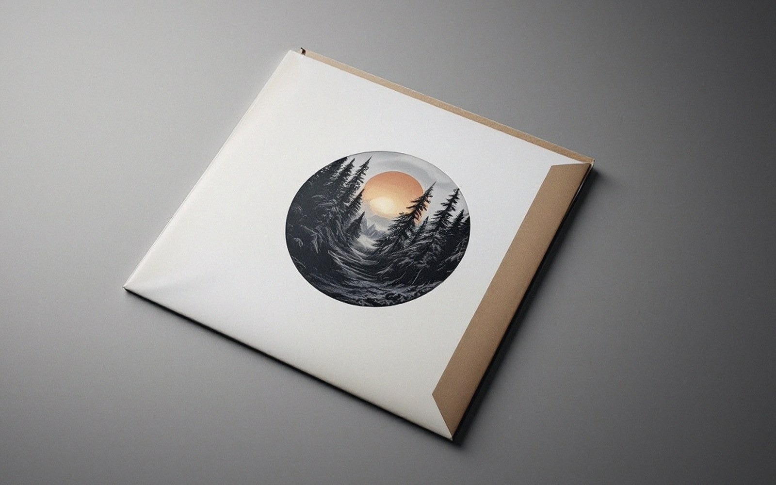
Translation problems
| Item | What it means |
|---|---|
| Panoramic compositions | cropping to square loses compositional tension at the horizontal edges |
| Spine text hierarchy | catalogue number is the element most commonly dropped on CD spines |
| Colour shift | uncoated board (vinyl) reads warmer and more muted than coated CD stock from the same separation file |