How a Nordic metal sleeve moved from painted board to pressing plant — and what was lost, changed, or clarified at every step.
The Brief, the Board, and the Original
Before any paint was applied, there was a conversation — usually informal, sometimes a single phone call or a scrawled note passed at a gig. The documented record for Nordic metal sleeve commissions of the late 1980s and early 1990s shows labels rarely issued formal written briefs. What the artist received was a title, sometimes a lyric sheet, occasionally a rough pencil sketch from the band. The rest was interpretation.
Most of the painters working in this circuit were not trained commercial illustrators. They were painters who happened to move in the same rooms as the musicians, and their working surface was almost always rigid board rather than stretched canvas — hardboard primed with gesso, or illustration board of the kind available at any Stockholm or Gothenburg art supply shop. Board does not flex, does not buckle under acrylic medium, and delivers a flatter surface that reads more cleanly under a copy camera. Whether the artists made this choice consciously for reproduction reasons or simply because board was cheaper and more convenient is not documented; the outcome suited the process.
Oil was common in the earlier period — slow-drying, richly saturated, capable of the glazed depth that made night skies and armoured figures glow — but the drying time was a practical problem for any label working on a pressed schedule. By the early 1990s, acrylic had become more prevalent for sleeve work: faster drying, equally opaque, and forgiving of the high-contrast colour decisions that would need to survive a four-colour offset separation. Some artists worked in oils and then photographed the painting early, before the surface had fully cured; this is occasionally visible in original artworks that survive in collections, where fine cracking has developed across dark passages that were still wet when the transparency was shot.
The production chain, step by step
- Artist's briefverbal or scrawled note; rarely a formal written document
- Original paintingoil or acrylic on rigid board, typically gesso-primed hardboard or illustration board
- Photographic reprolarge-format transparency (4×5 or 8×10 inch) shot under calibrated lighting at a repro house
- Colour separationoptical process camera (pre-~1990) or drum scanner; output: four halftone CMYK films
- Press proofcolour check against original board; not always performed by smaller labels
- Offset print runcoated paper stock; ink density and registration variables across the run
The finished board would arrive with the label — handed over directly, or in some cases sent by post flat, wrapped in cardboard, which is why a number of originals show diagonal pressure marks that do not appear in the printed sleeve.
The Camera Stage
The step between original painting and printing file was, through almost the entire classic period of Nordic metal, photographic. There was no scanning. A professional repro house — in Sweden, the relevant firms were concentrated in Stockholm and Gothenburg — would place the artwork on a copy stand under calibrated tungsten or strobe lighting and shoot a large-format transparency, typically 4×5 inch, occasionally 8×10 for work that would be cropped or heavily worked in separation. This transparency was the production master. Everything downstream derived from it.
The lighting conditions at this stage introduced the first systematic shift in the image. A painting with strong impasto texture — raised brushwork, palette knife marks — photographs with directional shadow under raking light, which can either emphasise or suppress detail depending on the lamp angle. Labels rarely had the budget to return for a reshoot, so whatever the repro house delivered was what went forward. In a documented number of cases, this is why printed sleeves show tonal relationships that differ noticeably from surviving originals: the camera flattened or dramatised texture that the eye, moving around a physical painting, would have read differently.
Colour temperature mattered too. Tungsten lighting, common in smaller repro studios, shifts the recorded image warm; daylight-balanced strobe pushes cooler. When the transparency was then handed to a colour separator, the separator worked from what the film showed rather than from the painting itself — which might not have been present in the room at all by this point.
Separation and the Four-Colour Problem
Colour separation converted the transparency into four halftone films: cyan, magenta, yellow, and black — the CMYK process. In the late 1980s this was done optically, using a process camera with colour filters and a diffusion screen; by the early 1990s, drum scanners running proprietary software had largely replaced optical separation at reputable repro houses, delivering tighter dot gain control and more precise shadow detail.
The specific challenge for Nordic metal imagery — and the reason four-colour offset has documented limits for this kind of work — is that the paintings tended toward exactly the tonal zones the process handles worst. Deep blacks built from rich oil glazes, near-black purples, dark forest greens: these all sit in the shadow region where CMYK struggles to maintain distinction. A separator working without a densitometer check against the original could easily flatten three distinguishable dark tones into a single black. Labels that cared — and some did, more than the mythology of lo-fi production suggests — would send a representative to the separator for a press proof check, comparing the proof against the original board under a colour-correct viewing booth. Labels that did not care, or could not afford to, approved proofs by phone or simply released whatever came back.
What the collector sees
| Item | What it means |
|---|---|
| Tonal flattening in deep shadows | a separation artefact, not the original painting |
| Saturation variation between early and late copies in the same pressing | ink density drift across the run |
| Slight misregistration on black plate | common period characteristic, detectable under a loupe |
| Spine width too narrow for vinyl thickness | documented tell of a first press with an underweight paper estimate |
The resulting films went to the printer with a specification for paper stock and a plate count. Most Nordic metal pressings of the period used coated paper for the sleeve — not the heaviest possible grade, because it added cost, but coated enough to hold the halftone dot without excessive ink spread. The board weight of a standard twelve-inch inner sleeve, the gloss or matte finish of the cover, the spine width calculated to the pressing's exact vinyl thickness: these were the printer's domain, and small labels sometimes got them wrong. A spine too narrow for the pressing is a documented tell for a first press produced with an underweight estimate; the cover cannot close flat and the opening edge buckles.
The Print Run and What Came Out
The offset press run itself introduced a final set of variables. Ink density could be adjusted across a run; a pressman who made a conservative call early in the run and a bolder call late produced sleeves with visible variation in saturation between early and late copies — detectable when you hold two copies from the same pressing side by side, which serious collectors do. Registration — the alignment of the four colour plates — was a function of press maintenance and ambient temperature in the pressroom; a slightly out-of-register black plate is common enough across Nordic metal pressings that it reads as period characteristic rather than defect on anything but a close inspection.
The question of what happened to the original board after printing was handled inconsistently. Some were returned to the artist; some remained with the label; some were simply lost in the administrative churn of small operations running on no margins. A painting that has survived is now a different kind of object from the record it generated — it shows what the camera and the separator did not carry forward, and occasionally shows pentimento (visible underlayer where the artist painted over earlier work) invisible in any printed version.
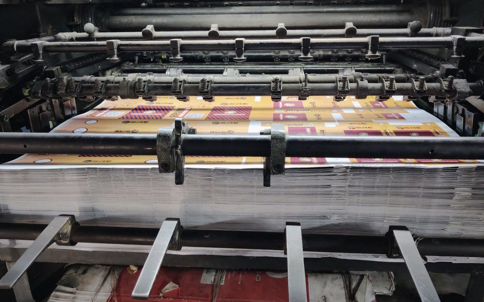
Reading the runout groove of a Nordic metal twelve-inch tells you which pressing you hold. Reading the sleeve — its colour register, its dot pattern under a loupe, the weight of its board — tells you something about the budget and the care at each step of a chain that began with someone handing a painted board across a counter and ended with a machine pressing ink onto paper at speed. Neither end of that chain is more important than the other. The record in your hands is the sum of everything in between.