
The commission document nobody filed, but which the finished sleeve still carries: what Nordic metal labels told artists, and what it reveals.
The Brief as Label DNA
Most collectors read the sleeve. Fewer think about what the label told the artist before a brushstroke was laid down. Where documentation survives — in liner note acknowledgements, published label histories, and artist interviews — the commission brief turns out to be as revealing as the finished image.
The consistent elements across documented Nordic metal commissions are four: a reference image or mood description, a colour requirement, a physical size specification, and a deadline. What changes between labels is the weight given to each, and that weighting tells you something precise about how the label understood itself.
Earache and its licensed Nordic partners in the early 1990s tended to specify colour in terms of print process — "must separate cleanly to four-colour offset" — because their pressing and printing volumes made repro cost a live concern. Four-colour offset lithography imposes real limits on saturated darks and fine line detail, and a brief that names the print process rather than the desired mood is a brief written by someone who has already sat with a printer's proof that came back wrong.
The brief's four elements
| Item | What it means |
|---|---|
| Reference image or mood description | what the label told the artist to think about, not what to paint |
| Colour requirement | sometimes a print-process constraint, sometimes nothing at all |
| Size of original | determined whether detail survived reduction to twelve-inch or CD dimensions |
| Deadline | its pressure visible in layouts where type and image were never reconciled |
Smaller Swedish and Norwegian labels, working with individual artists rather than agencies, tended toward reference imagery over technical instruction. A documented brief from the early Scandinavian black metal period described the required image in terms of a specific geographical location and a season — dusk, winter, a named forest district — with no colour specification at all, because the original was always going to be painted in oils or gouache and photographed rather than scanned. The label's aesthetic identity was carried by that latitude, not by a Pantone number.
Size of the original mattered because reproduction method followed from it. A painting made at roughly twice the finished sleeve dimensions tolerates more detail loss in reduction than one made at exact size; labels that understood this wrote it into the brief. Those that did not sometimes ended up with a finished twelve-inch jacket where fine linework had collapsed to muddy tone — visible still in certain first pressings if you look at the inner border detail under good light.
Deadline pressure shows in the record, too. A sleeve where the typography sits awkwardly against the image — crowding it, or leaving dead space — often traces back to a brief where the artwork and the layout were commissioned on different schedules and never truly reconciled.
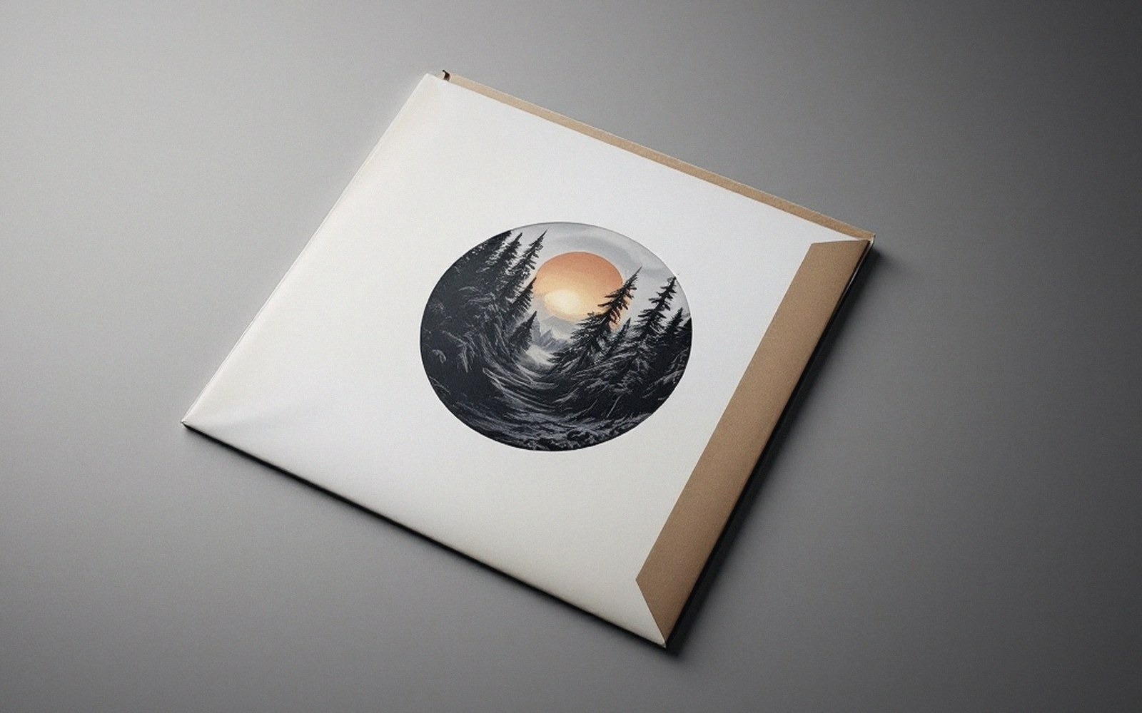
The brief was never the art. But it framed every decision the artist made.